
Answering questions before they come up.
Carmax had a design system that went stale from a lack of support. I was hired to relaunch it and make it better.
Working alongside a couple of core developers and with the input of designers and developers across our org, I completely rebuilt unsupported Sketch libraries in Figma.

The system also included corresponding web components and full documentation what was available, what it could do, and best practices for implementation. It introduced a series of tones associated with specific colors within the palette and a full dark mode theme.
These resources resulted in full adoption by designers and extremely high adoption by developers. People liked using it and were very active in working to expand and extrapolate from it and contributing back to make it better.
Problem
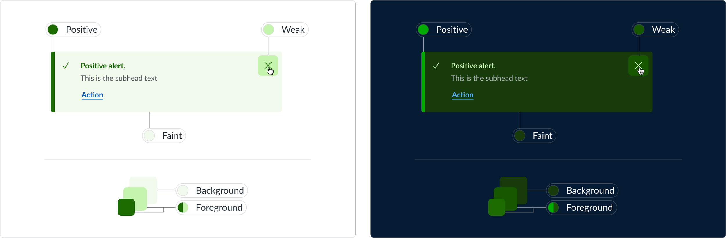
When I arrived, the approach to color was to have a full color palette with tints and shades from 50-1000. Some of them had defined usages, but not all. There was no solution for dark mode or accessibility and limited documentation around how to use anything. The intention was that this palette also served the purpose of illustration, which was why it was so vast, but there wasn’t enough guidance around when or where to use each various shade in a product design context.

Solution
Working from that illustration palette that carried forward from the previous system, we trimmed that down to colors that would actually get repeated usage within the new one. The full palette didn’t actually go away, we just put it behind a curtain, which made the approach easier for designers. For added ease, colors were then assigned to tones depending the role of something within a product and what it was meant to communicate to a user.
For parity, these token styles within Figma were then named the same as within the code repo, so that everyone now used the same terminology.

The tones were selected to be accessible and support the communication of various elements in both light and dark mode. More intense, fuller saturation colors were brought up to the foreground while more muted ones served as backgrounds and surfaces within the interfaces. This helped to build a clear visual story and focused the user’s attention when and where it was needed.
Problem
The historical sketch library that the design system team was working from was a bit outdated and didn’t necessarily provide parity between what existed for a coded component and what it could do. As a shared resource, there was no active management of what it was, what it contained, and who could update it. This coupled with the fact that there was little communication around what was happening when things changed and what users could expect moving forward led to a bit of chaos.
Solution
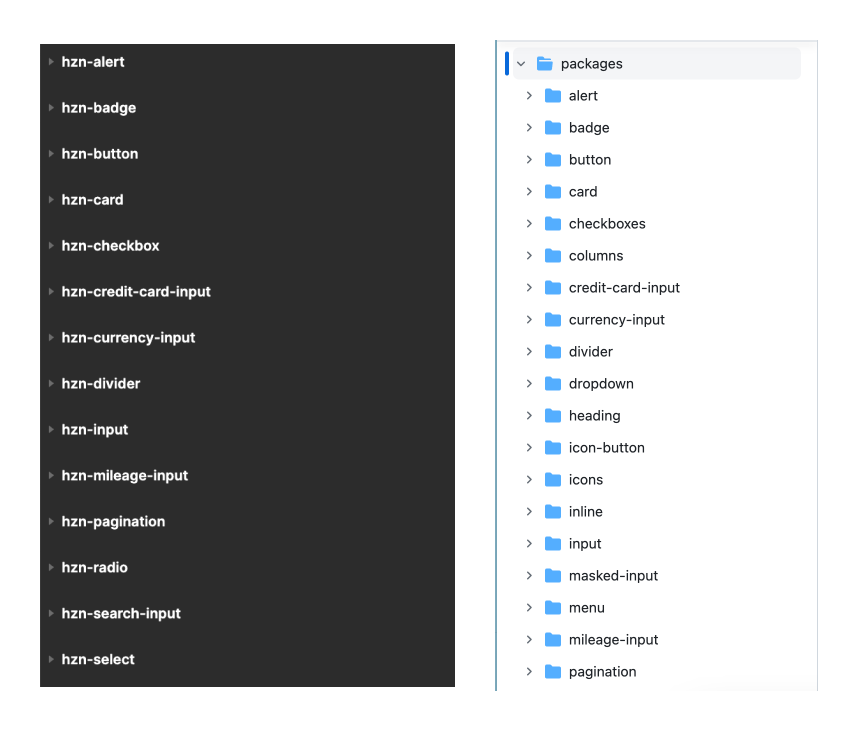
To solve for this, I led the team to take a different approach. One of the things we had going for us was we were moving off of Sketch and towards Figma. In doing this, we broke the consolidated library apart into individual component files. This had two major benefits:
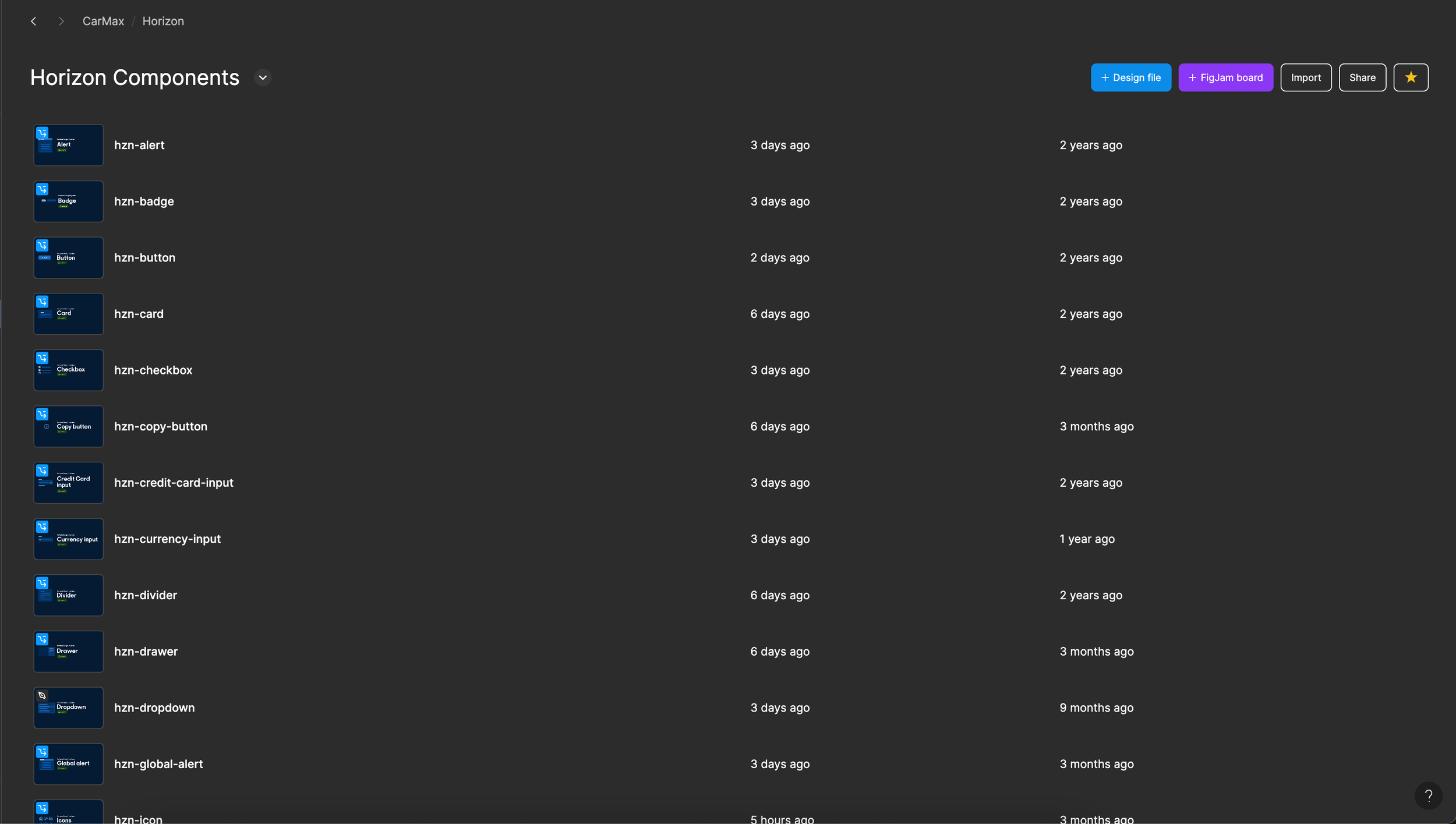
It helped to manage updates as we moved forward. If a change was being made to only the Alert component, that’s the only place designers would see a change.
It allowed us to name, create, and build design files in the same way coded components were. This aided in communication between designers and developers when they used components to build their products, as they were assured that everything that existed within the figma space had a counterpart within the code repository.
Problem
The biggest gap from the old system to the new one lay in documentation. Frequently the answer was, “oh, go to so-and-so. They know”. On top of that, when you did get into actual written documentation that did exist, it was pretty thin.
Solution
This was solved for by launching a new-and-improved docsite that was very robust and looked cool, given the dry topic. It included light and dark themes from its inception, and provided very thorough documentation around everything we published, from both design and code perspectives.

As the system evolved, the docsite became a platform for other groups to host their own documentation, including brand and writing. We implemented a robust site search functionality and rebuilt the site as a technical POC for teams that asked about implementing the system’s components within a server-side rendering environment.
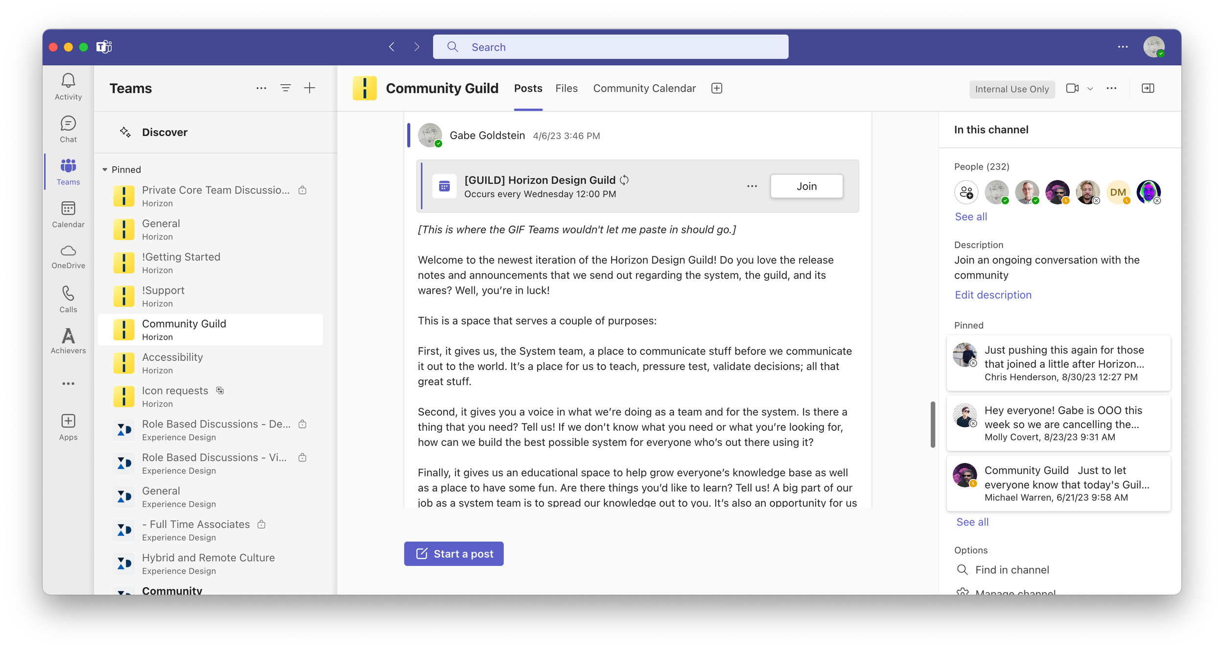
For additional support, we set up a number of teams channels where we could make announcements, field questions, and solve problems. I also relaunched and host a Design System Guild session once a week. At first, this ritual served to take input from the community and validate decisions that we planned to take for the system. When I first arrived and we created a preliminary backlog of potential system additions, this served as a teaching platform to explain to product designers the nuances between different components we might make, how they might be used, and whether or not they were high value adds at that stage.
As it evolved, it has turned into a get-together where we share out, take feedback, teach, and learn.