
While working at U.S. Bank, I had the opportunity to contribute to Shield, a design system established before I joined the team. After transitioning through a few different teams, I began working on the system, which was primarily focused on component development rather than streamlining screens or user flows. Although some of the initial work was routine—like fixing a Sketch component bug or updating spacing in a radio group—I was later assigned to tackle a more complex and critical component: the date picker.
Designing a date picker is widely regarded as one of the most challenging tasks in design systems. Many teams prefer to adopt and theme pre-existing components, but Shield required a custom-built solution to meet its unique needs.
Scope
My task was to design and deliver a fully accessible, reusable, and flexible date picker that could support multiple use cases across the organization's ecosystem. This included ensuring:
Comprehensive accessibility (ARIA support, focus management, and more).
Visual consistency with the rest of the design system.
Scalability to accommodate variations like single date pickers, date range pickers, and month/year pickers.
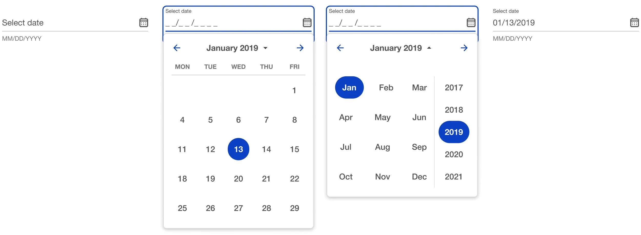
Research
I began by analyzing how other leading design systems approached date pickers, drawing inspiration from Material (Google), Polaris (Shopify), and Carbon (IBM). Without tools like Component Gallery (which didn’t exist then), I compiled insights into a deck for review with the team and UX director. We identified what worked well in other systems, what didn’t, and how we could improve.
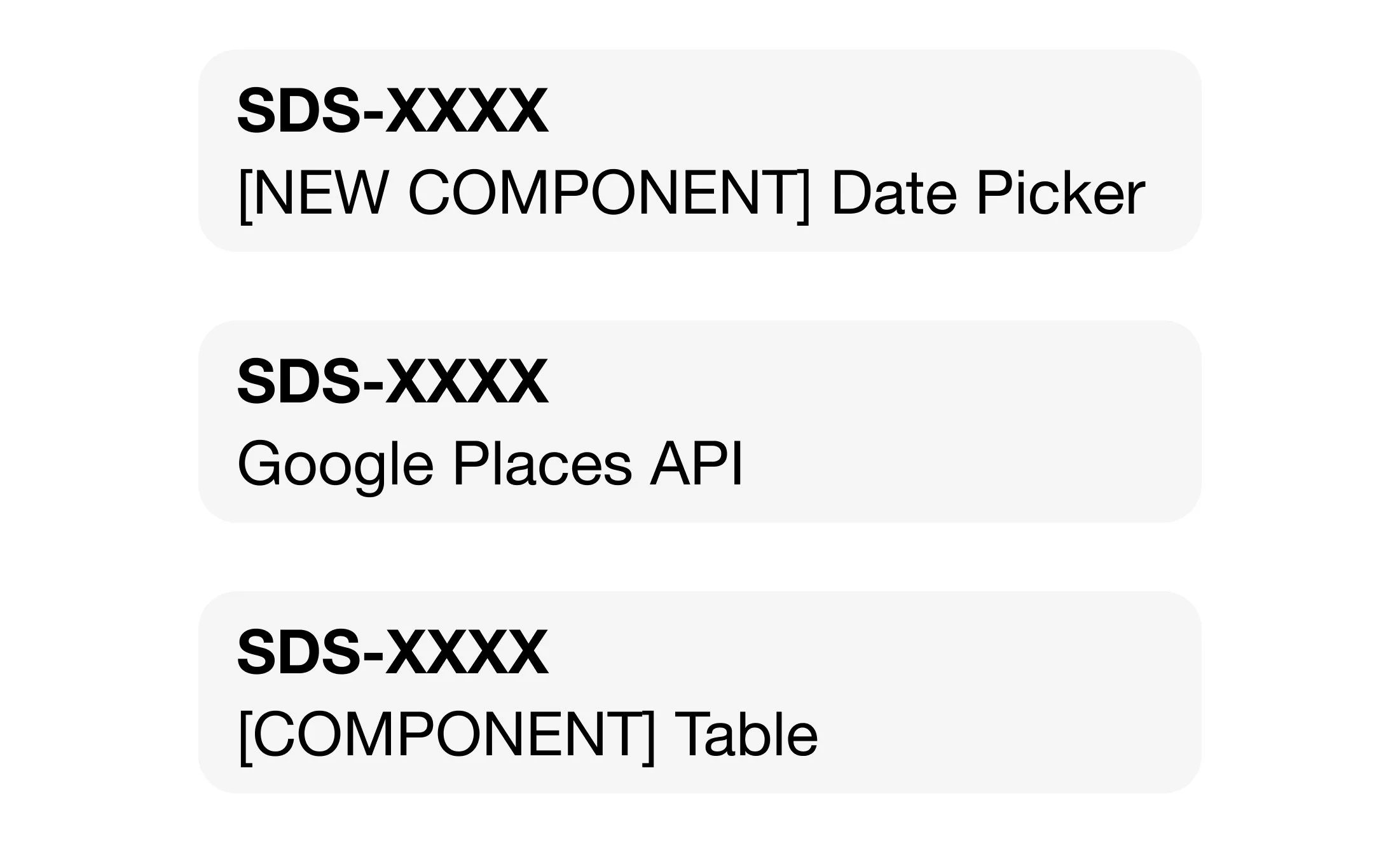
Design
date range picker
Once the research was complete, I moved into the design phase. Flexibility and scalability were critical goals, so I worked to create solutions that could support multiple variations of the date picker, including single date pickers, date range pickers, and month/year pickers.
States
For each calendar element, I defined a comprehensive set of states, covering interactions like hover, focus, disabled, and selected. For ranges, I incorporated states to show when a date was part of a selected range versus an individual selection. Additionally, I designed clear visual indicators for the current date and month to enhance usability.
Animation GIF?
To add polish, I collaborated with an animator brought in by the UX director. Together, we spec’d out micro-animations that enriched the component's interaction design, providing subtle yet impactful transitions.
code snippet
Accessibility was a top priority throughout the process. The date picker was designed as a combobox, incorporating dialog behavior with focus trapping to ensure smooth interactions when the picker was open. ARIA support was integrated, including live regions for updates, hidden labels for screen readers, and hotkeys for efficient keyboard navigation. The layout was made fully responsive, adapting seamlessly to various screen sizes and orientations.
three icons: sketch, react, book
Finally, I ensured a seamless handoff by delivering three key outputs: Sketch symbols for design teams, a React component for developers, and comprehensive documentation for the internal docsite. The documentation detailed every aspect of the component, including design principles, coding standards, content guidelines, and accessibility features.
Results
text message
The date picker component was a standout accomplishment within the Shield design system. It became a robust, scalable, and accessible solution, addressing multiple use cases across the organization.
Despite the challenges, the final component was praised for its attention to detail and thoughtful execution. After leaving U.S. Bank, I learned that our team’s work on this project was formally recognized for its excellence, a testament to the collaborative effort and high standards maintained throughout the process.