
Overview
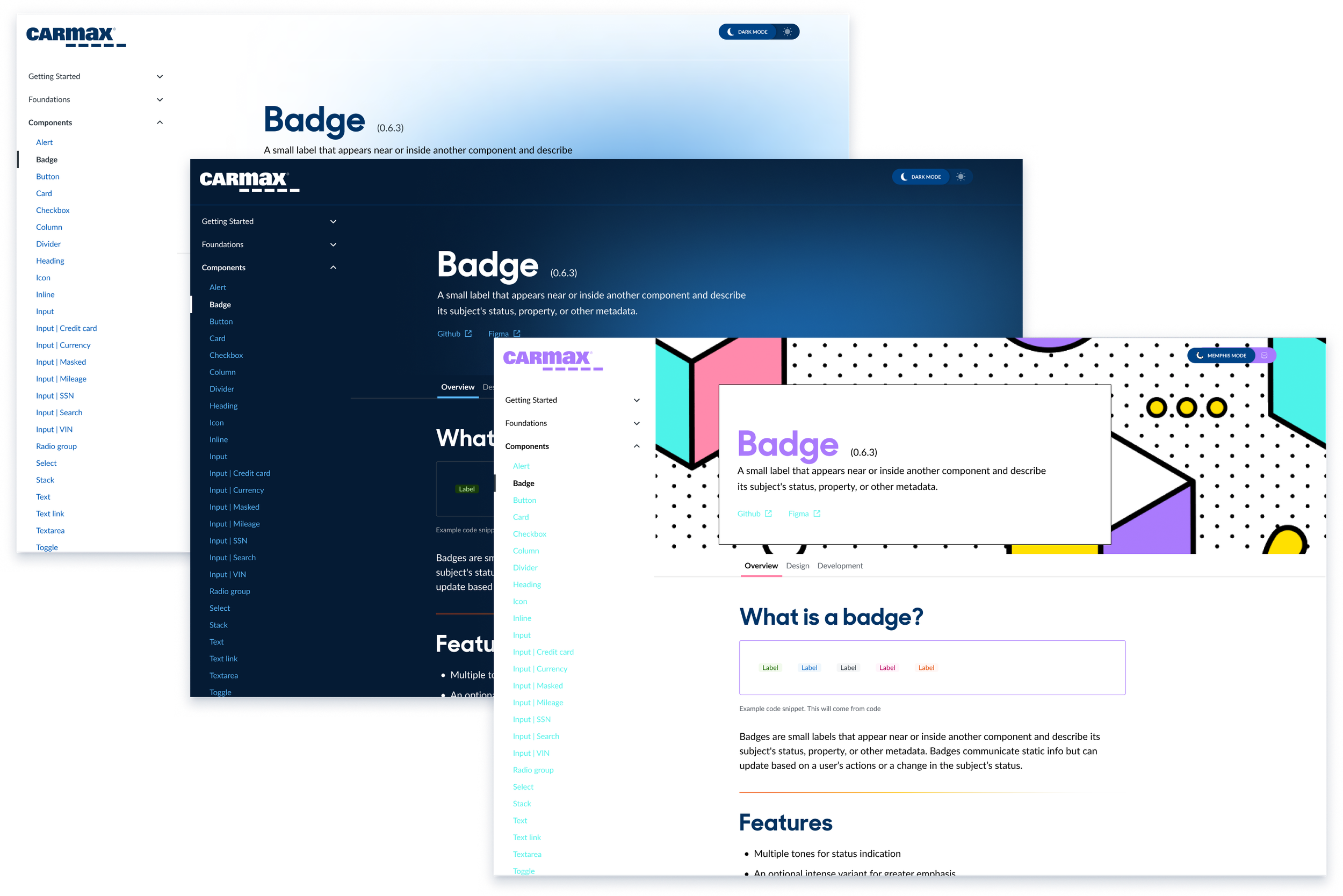
In April—shortly after launching the Horizon design system docsite—we introduced a surprise third theme inspired by the iconic style of the Memphis Group from the late ’80s and early ’90s. This lighthearted experiment doubled as a proof of concept for our token architecture and a clever way to draw attention to the system’s launch.
As someone who grew up in the early ’90s, designing this theme was an absolute blast—and a chance to connect nostalgia with practical systems work.
My Role
As the designer on the systems team, I led the visual direction for the Memphis Theme. Inspired by a vintage car with bold geometric flair, I:
Defined a custom Memphis-inspired color palette
Created alternate iconography and decorative assets
Ensured theme consistency using our token infrastructure
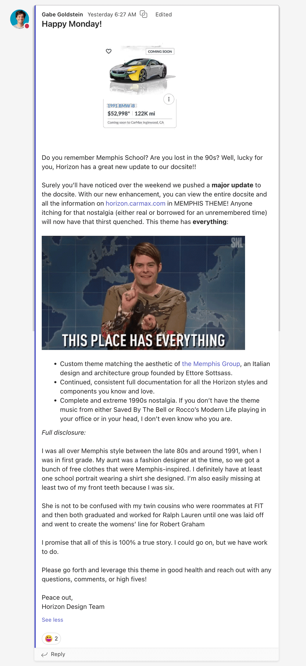
I also authored a cheeky announcement message to introduce the theme internally—framing it as a fun discovery, while showcasing our system’s flexibility and extensibility.
System-Level Proof
This theme wasn't just a joke—it was a test. We implemented the Memphis Theme entirely through design token overrides. No changes were made to components or layout. This validated:
The scalability of our token-based theming
The ease with which alternate experiences could be layered on top of the system
Our ability to support creative expression without compromising structure
Impact
The theme made waves.
🧠 Designers responded with, “Wait—this style has a name?” and “I always called it the Saved by the Bell look!”
📈 Traffic to the docsite spiked significantly following the theme’s launch
🤝 Visibility for the design system increased across the product org
🛠️ It sparked interest in how teams could use theming in their own contexts (beyond just brand modes)
This small side project had a big cultural payoff—and positioned the system not just as a tool, but as something joyful and expressive.