
Problem
During my time working on the design system team focused on native apps, I got some requests for easily usable and customizable design components that were based on the look and feel of the native platforms for iOS and Android. Simply put, an easy-to-use design tool that requires a low level of effort from a development perspective so that teams could get to market faster.
Solution
I solved this one in a couple of ways. My first approach (for iOS), was to take components provided directly from the Apple sketch library and theme them using the bank’s color palette. This resulted in a full set of reusable components. They all mapped directly to system-level components within the platform that were themed similarly. Within the directories, they were annotated with a ★ emoji, indicating that the system team deemed them something that wasn’t meant to be broken from the symbol.
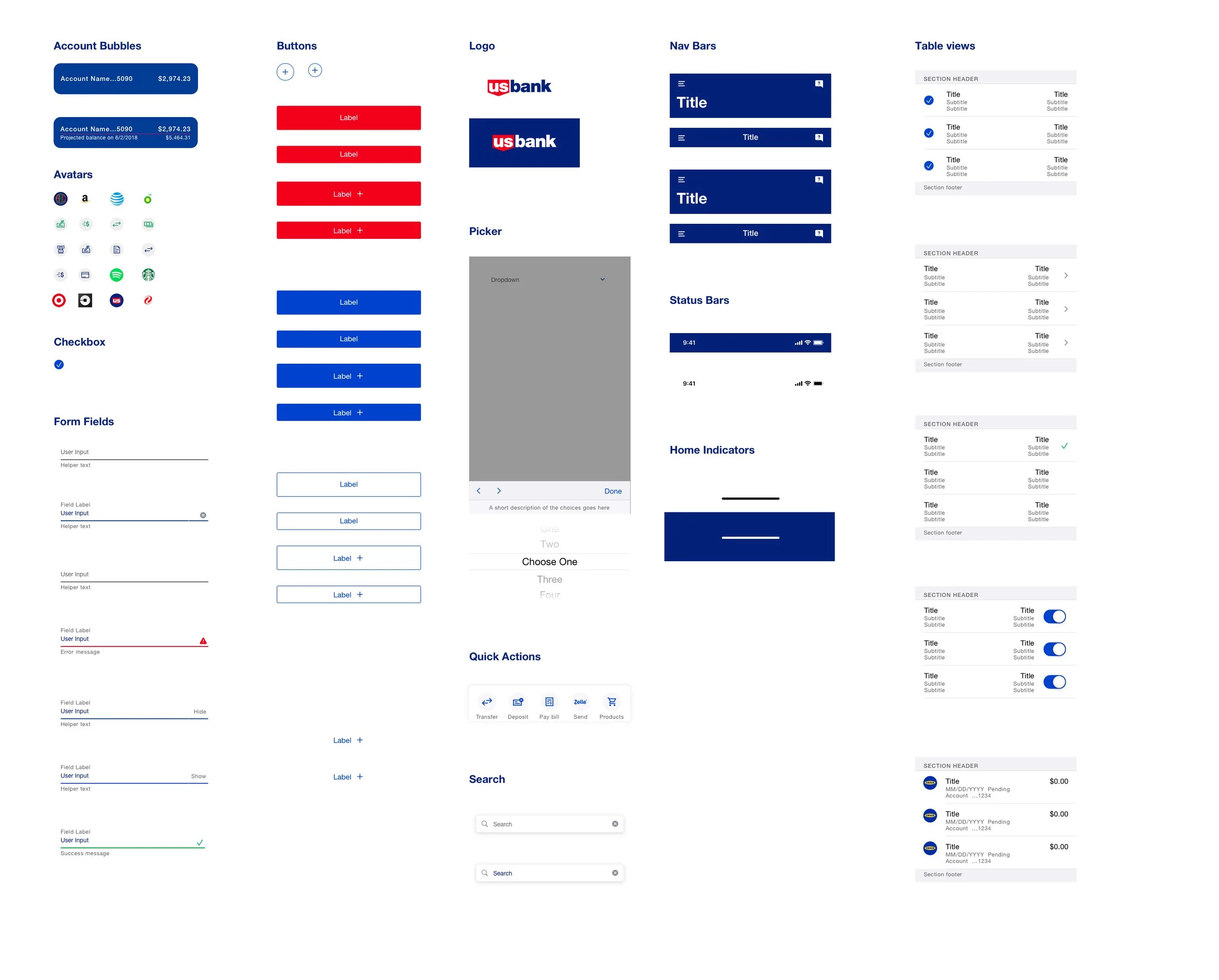
To take that a step further, I then built out a set of templates for several different screen types across the app. These were labeled with a 🔨 emoji, indicating that though they were provided in a certain configuration, they could be broken apart and their components could be reused as necessary throughout the design process.

Solution
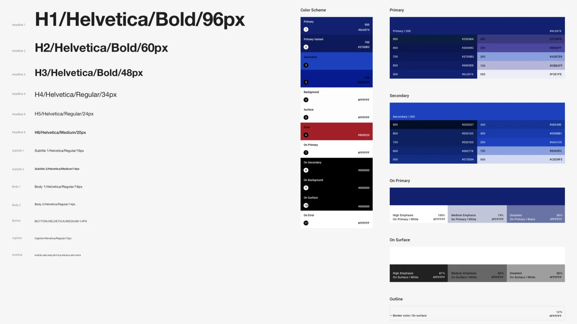
When we got to Android, I discovered that this could be done with even less effort. Material releases a full set of components to design with that match the coded ones. The task here was to update the styles of their color palette and font ramp to those from the bank’s enterprise system.
Populating these styles provided the team with a full set of ready-to-use components that could be quickly mocked up in even less time.

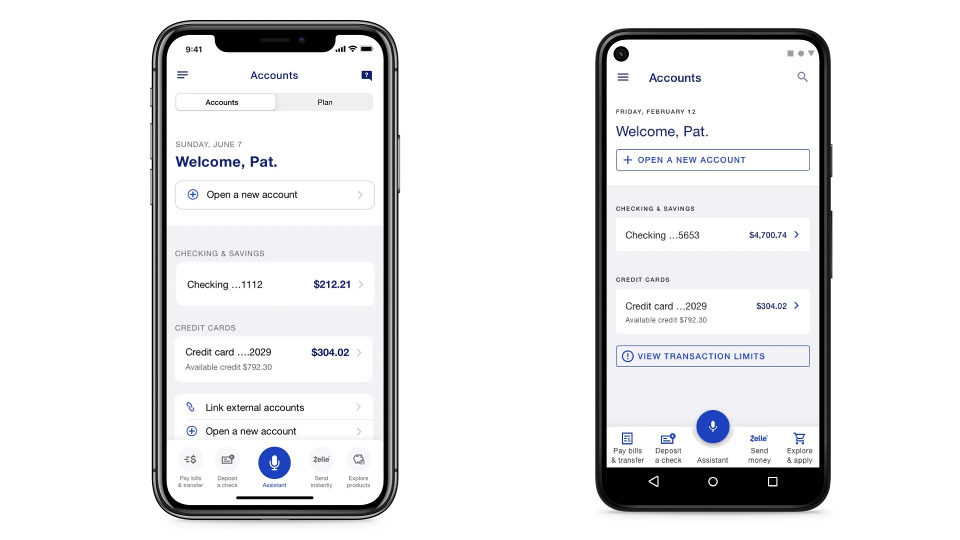
As a POC, I was able to reproduce the same screens that are live in the iOS version of our app in a fraction using the custom library I had built. This approach not only saved time but also ensured consistency across the app's visual design. It also allowed android developers building the app a true representation of what they were looking for instead of needing to guess from the iOS equivalent components.

Results
Ability for teams to iterate more quickly
Better communication between designers and developers because of consistently named components and patterns
Raised accessibility from mapping type ramps to system level styles and the apps being able to leverage dynamic type sizing. This allows text to properly resize when users increased or decreased these sizes within system preferences of their phone.