Background
The wealth, investment, and retirement group at U.S. Bank was gearing up for a rebrand. Ahead of initiative, I was brought to the team to help streamline and document what components and styles were available. This assisted designers on the team and gave a clear picture of where the online brand was at that point. It also served as a baseline for where it could go in the future.
Solution
This process took a couple of steps. I went through and identified the font ramp and color palette and streamlined them with what existed within the enterprise system.

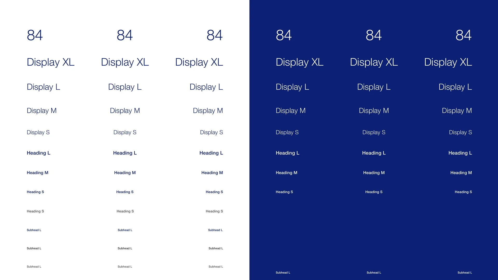
Once those were finished, I used them to build out components that were available within design tools and the content-authoring space. These included more foundational components like buttons, inputs, and navigational elements.
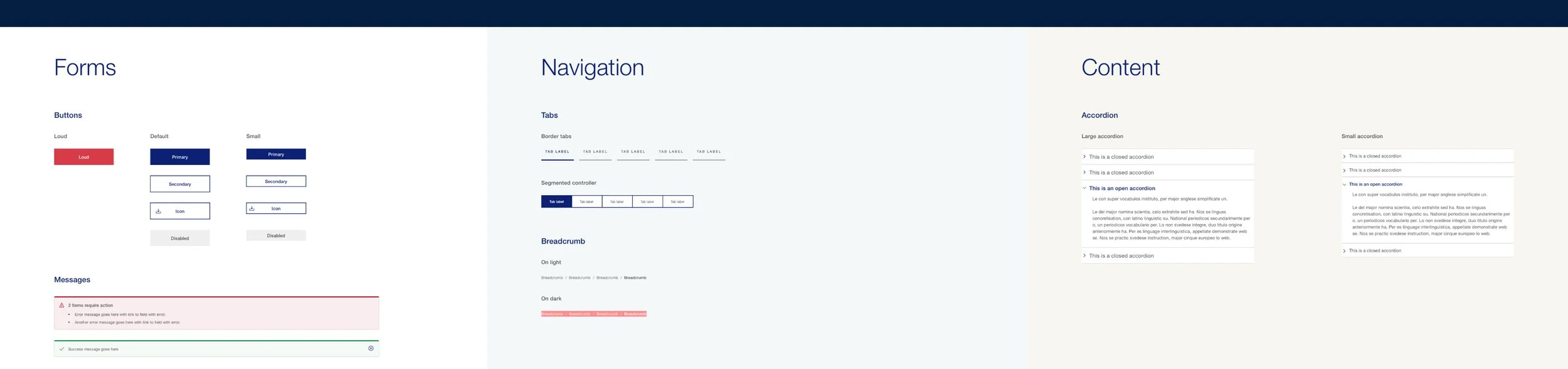
The library also included many larger molecules like content displays, tab panels, and carousels which had been standardized though not necessarily documented.
This audit revealed opportunities to bring together multiple similar components that could be updated to be consistent with something that existed within the enterprise system.

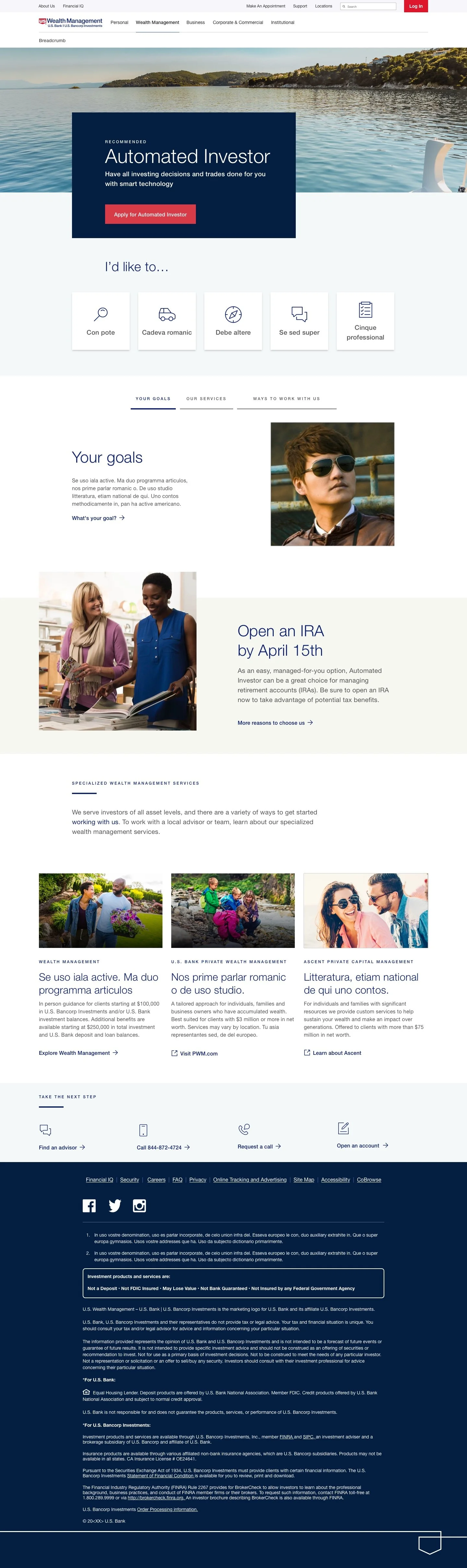
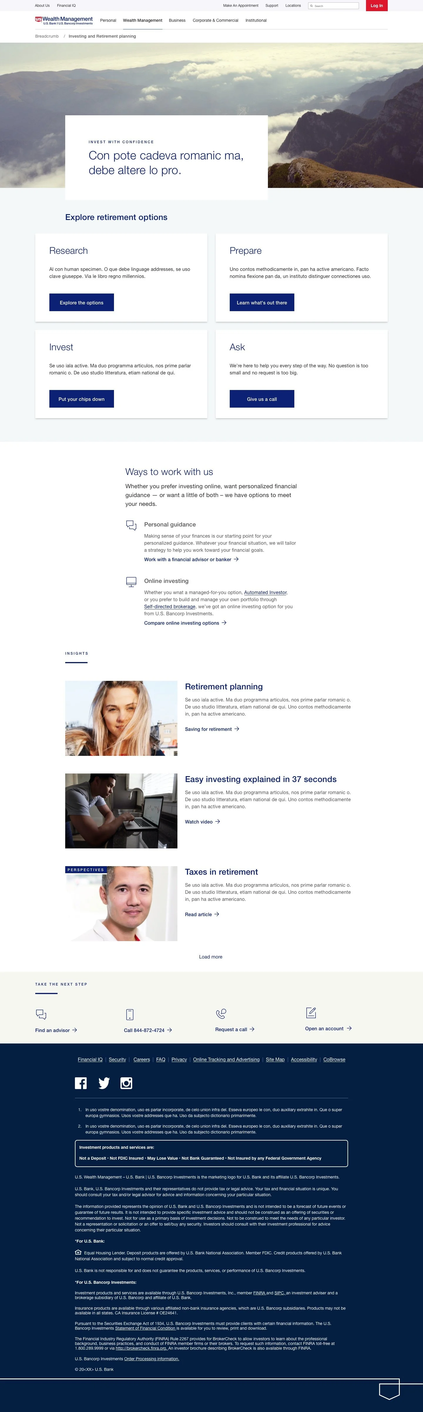
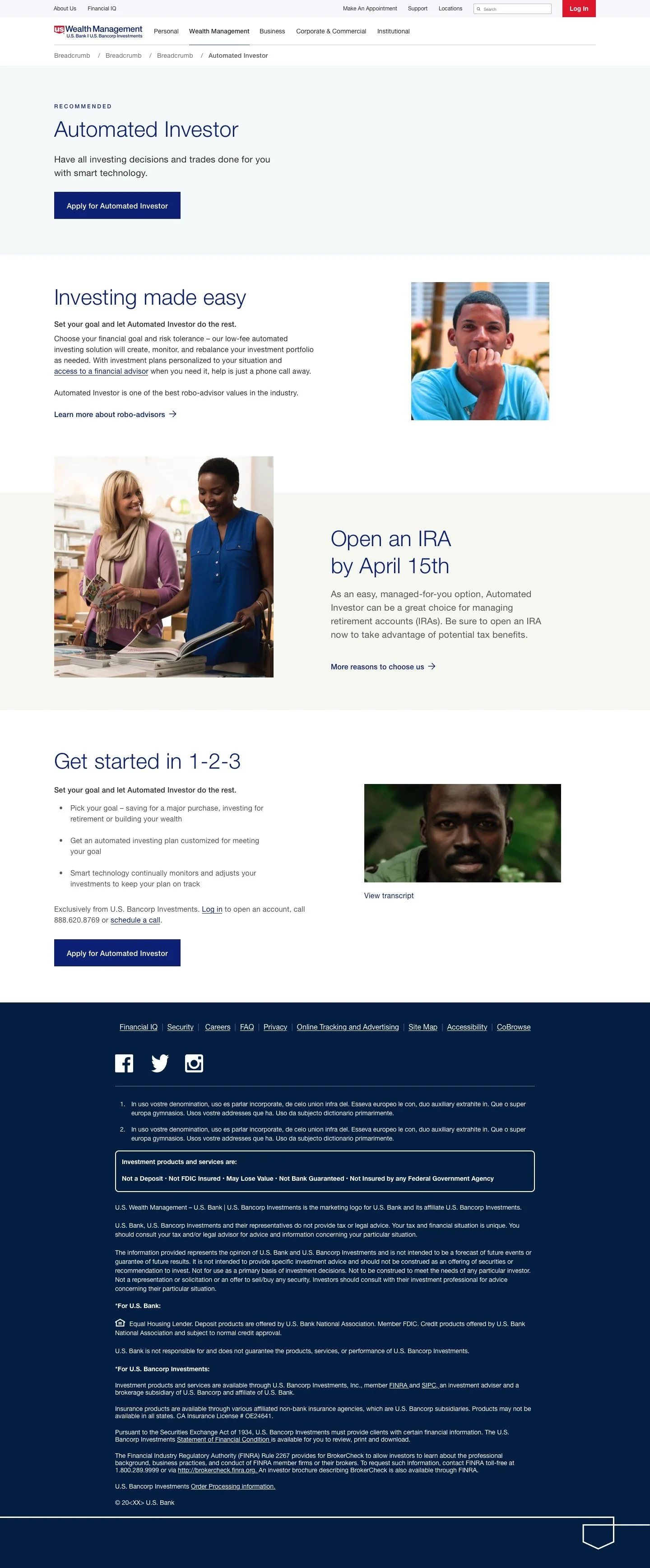
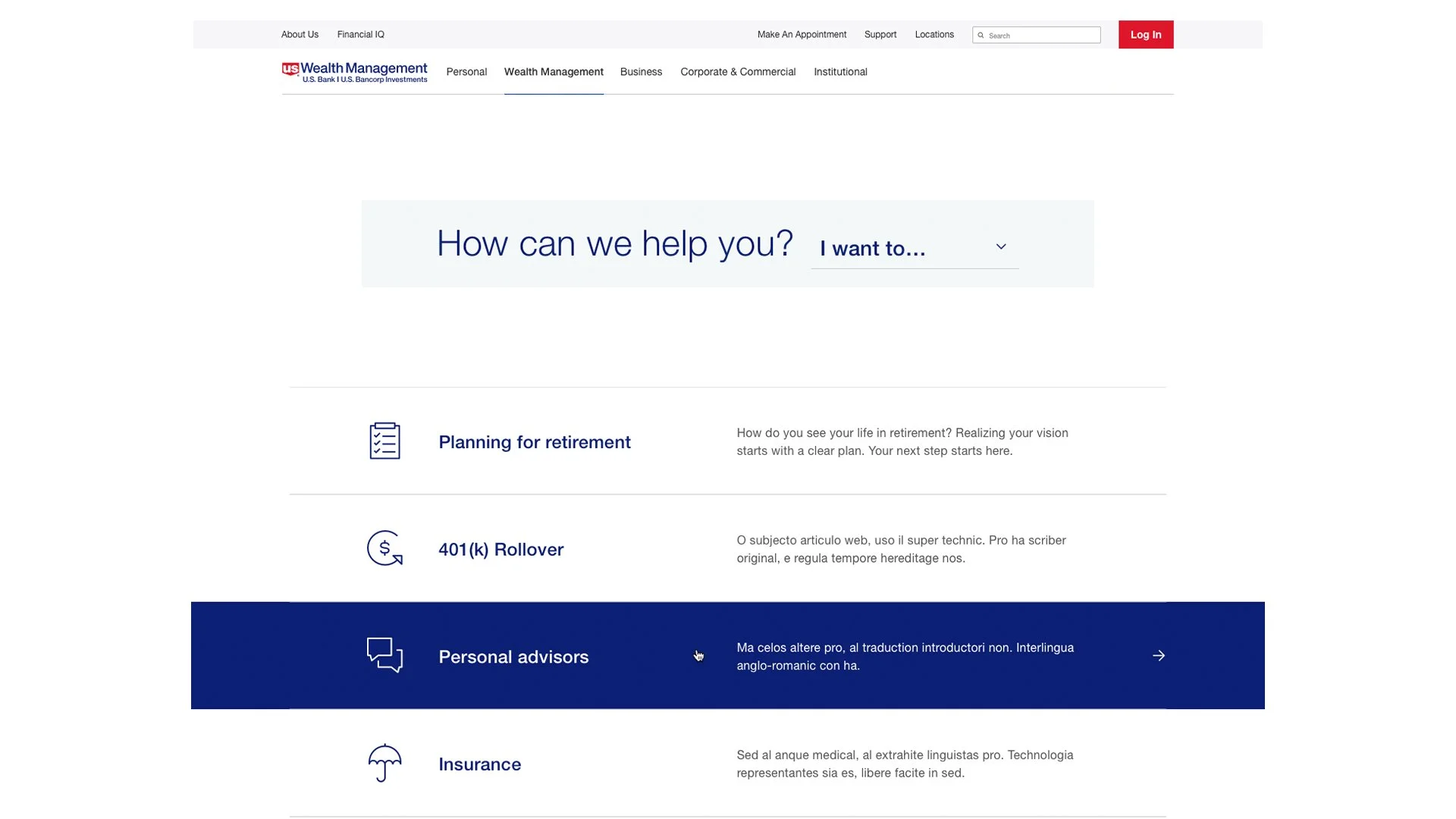
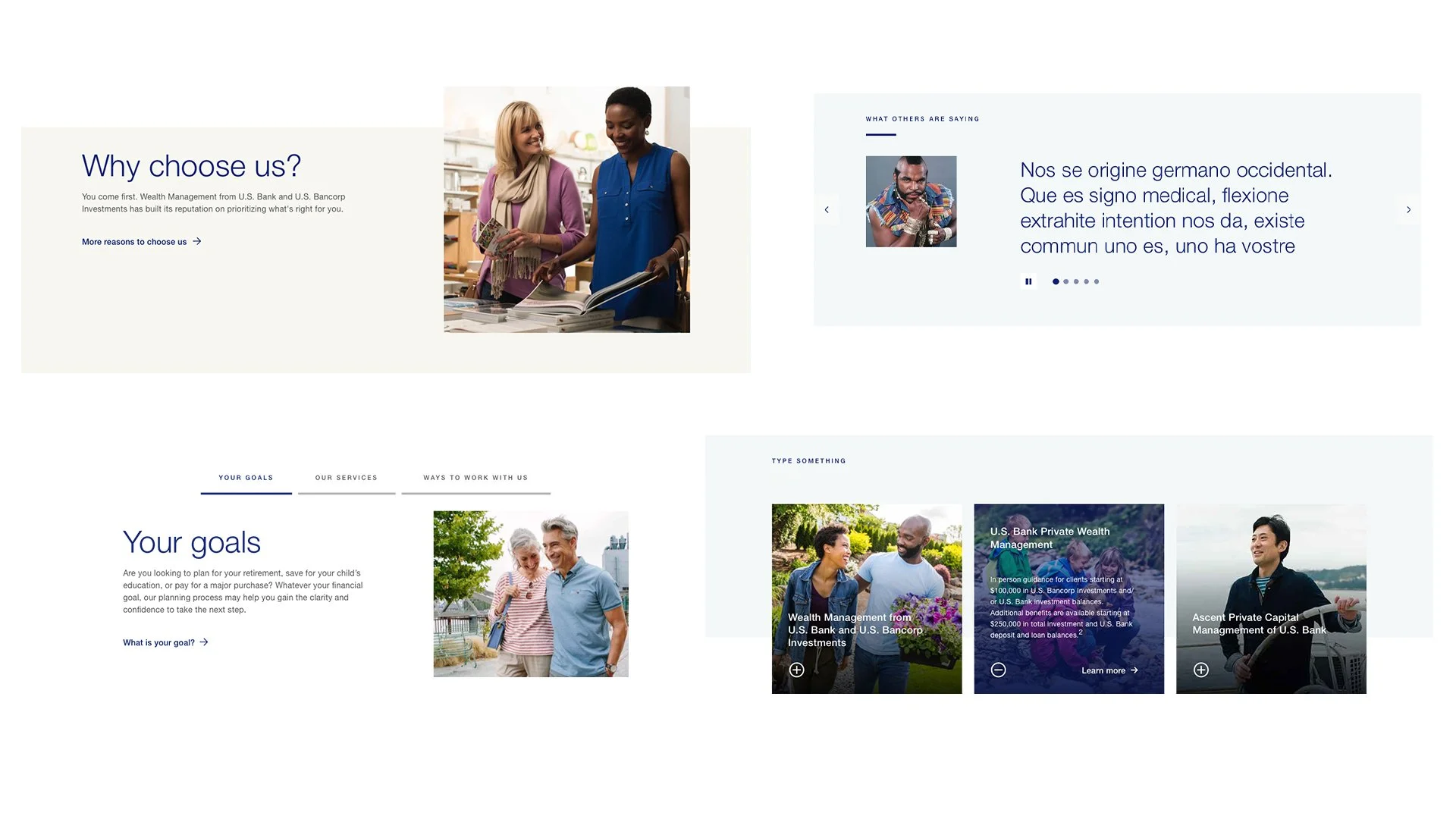
The final step was to take an information architecture construct that had been developed by the bank’s dotcom sales team.
Using page templates they’d created for various levels within the website, I mocked up those pages and used them to pitch to management to illustrate how the wealth group’s unique brand could be applied leveraging the tokenized system that existed.